A graphic designer whose work reflects the harmony, movement, and vitality found in nature!
Daisy .A Sanchez -
Branding and Logo Design
Branding and Logo Design
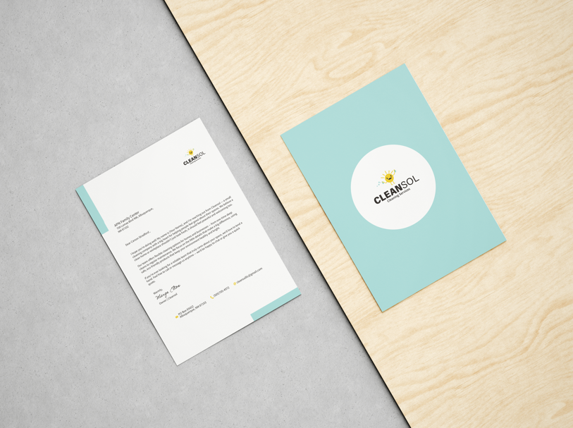
CLEANSOL
Medium: Illustrator, Photoshop
This project is for a cleaning company named Cleansol for clean space and sol, which was used as a creative misspelling for soul, fitting the clean space, and clean mind/soul, or also the Spanish translation for the word sun, emphasizing the brightness of a place that is clean. For these reasons, when it came to choosing colors, light blue for water, cleanliness, and yellow for the sun were chosen. The logo created was a sun mascot holding cleaning products. The goal was to make it look friendly and trustworthy.

FLOATING LIGHTS
Medium: InDesign, Photoshop, Illustrator
For this project the goal was to maintain a balanced logo design for a festival campaign. The design principles that were focused on in this design were shape and color. The shapes used were rounded and formed a silhouette of row people holding a lantern. To strengthen the shapes the use of bright yellow and a dark blue were used to create separation of the people and the lantern but also still maintaining focus on what the event is about and what time it would take place so blue was used to represent the night sky and yellow to represent the lanterns and light.


Medium: Illustrator, Photoshop
This Project was based on an overseas airline. The goal for this logo was to communicate movement using lines and color emphasis. The start of the logo began by looking like an airplane shaped like a shark. There wasn’t enough sense of movement, and I felt a bit stiff. During the process, it was realized that thinner lines directing the plane with add a more sense of direction and movement. The color choice of dark blue and light blue gives it a light, watery feel.
GREAT WHITE

SÜTHME
On a mission to creat natural sutainable products to enhance your beuty and rejuvinate your skin.
The goal of this project was to create a cosmetic brand that conveys a relaxing, clean, and natural aesthetic. The Logo for the brand is based on a female silhouette holding her face. The incorporation of soft edges and rounded ends was to emphasize the delicacy and smoothness of skin. The placement of the shapes gives the logo a sense of care and peace.


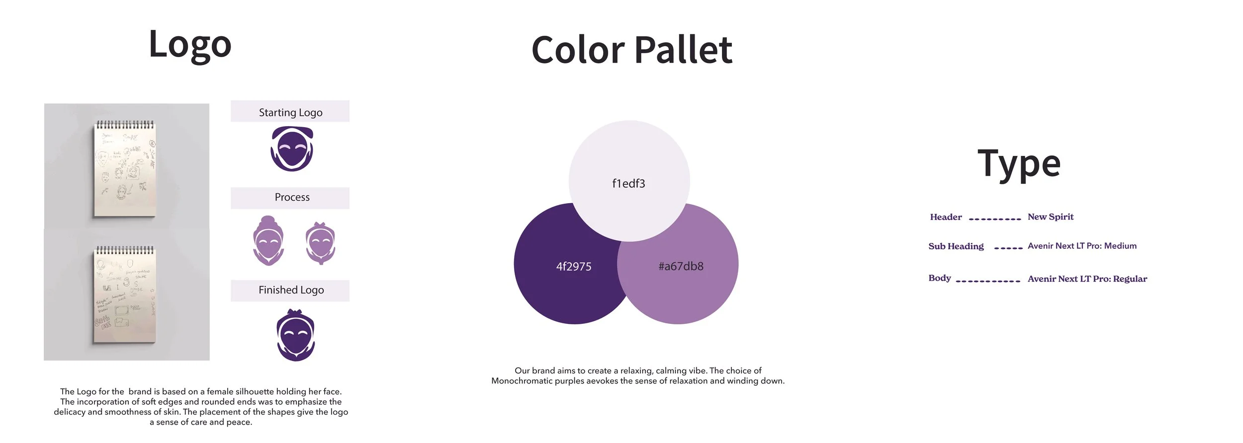
LOGO
COLOR PALETTE
TYPE
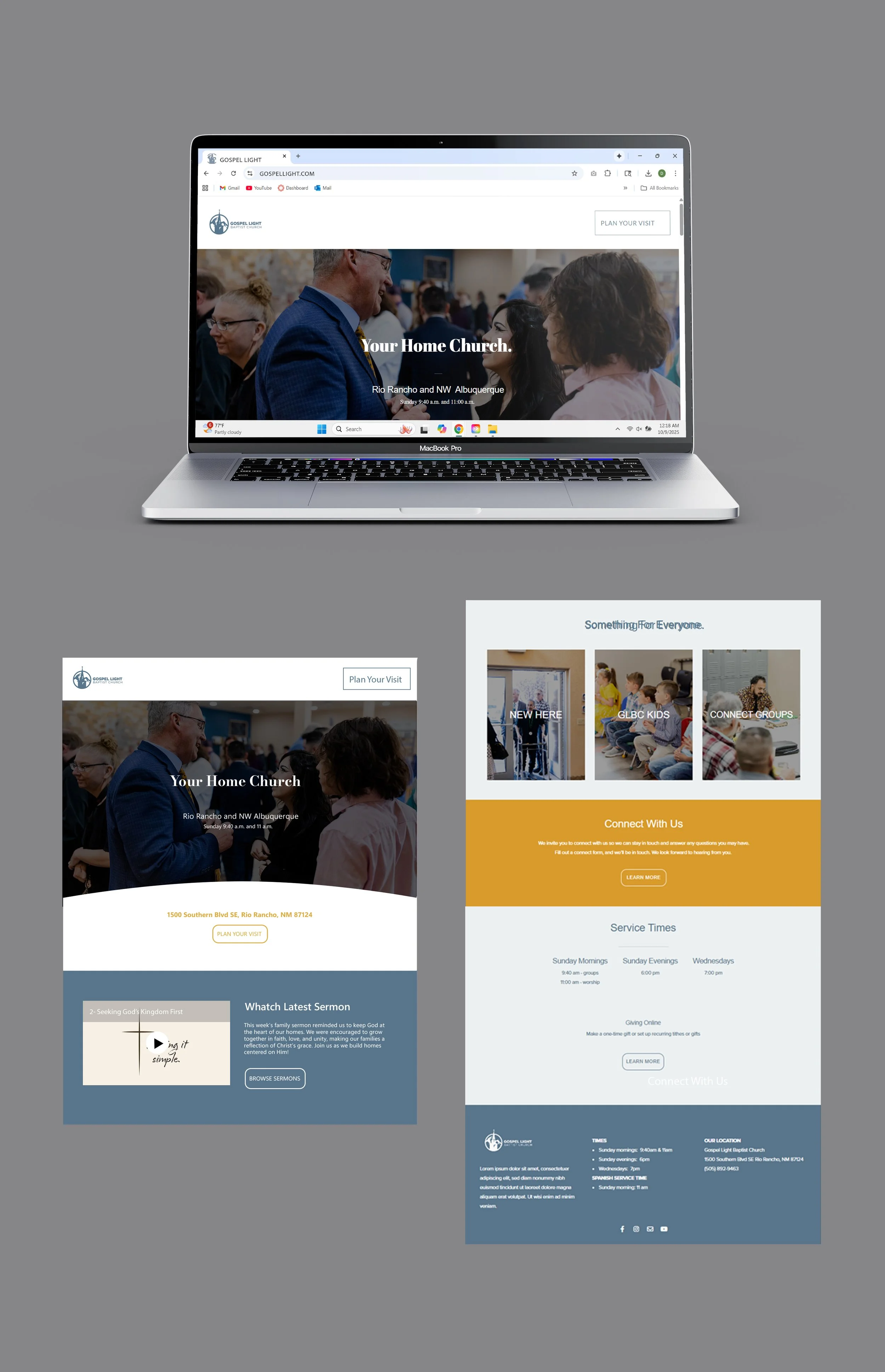
WEB DESIGN
Medium: Subsplash
The goal for this website was to update the style of a Church website. To start a completely new template was created to begin from scratch. The colors were changed for browns and reds to blue, grey, and mustard yellow. The Text was then changed to a sans-serif text for a clean and modern look. The flow of each page was changed and designed to be easier to navigate for older people. Cards were added to the main page to redirect users to different categories offered by the church. The updates allowed the website to have a new system with flow and neatness.
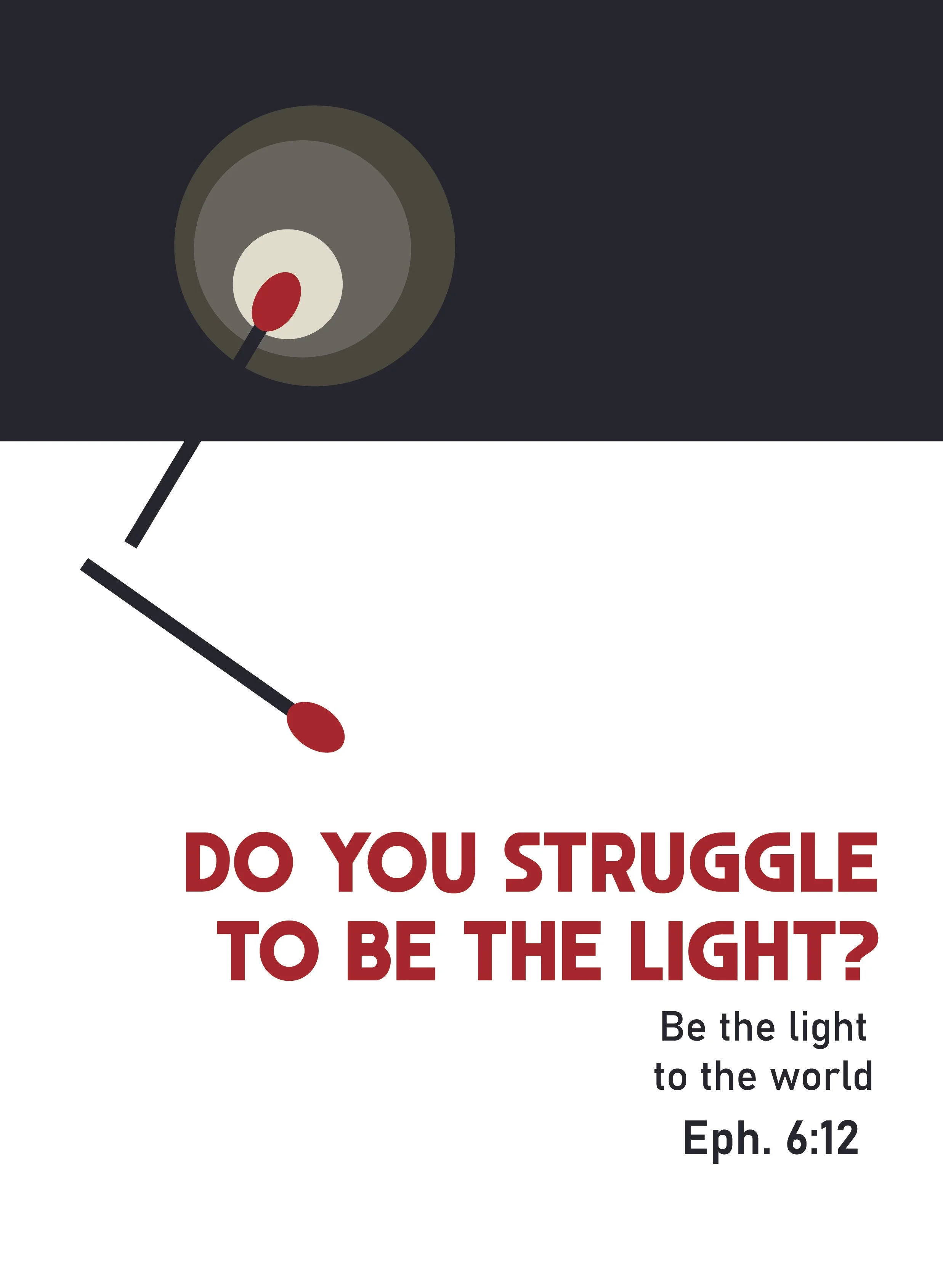
BIBLICAL POSTERS
Medium: Illustrator, Photoshop
The design principles used for these three posters were balance and negative/positive space, with the emphasis of one color used as a focus for the story the poster is based on. To balance the poster’s heavy text in the one color used the emphasis is placed in the positive space. The placement of the text was also thoroughly thought through so as not to tip the scale in the balance of the positive/ negative space.